Chapter 11 Visual Acuity and Contrast Sensitivity
Visual acuity tests
Introduction
Given the variety of its applications, it is not surprising that many different types of visual acuity tests have evolved. Generally, these tests were developed with little concern for standardization. Since the 1980s, several attempts have been made to formulate standards for test design and administration. The Committee on Vision of the National Academy of Sciences-National Research Council (NAS-NRC)1 has published standards for clinical testing of visual acuity that are widely adopted in the USA, and the British Standards Institution2 has published similar standards for the UK. The NAS-NRC standards are used as the basis of this chapter.
Chart design
Optotypes
Most familiar acuity tests require the subject to identify letters arrayed in rows of decreasing size. The so-called Snellen acuity test is the prime example, although Snellen acuity now usually refers to a way of reporting test results rather than to any particular type of chart. To facilitate testing of young children and people unfamiliar with the Latin alphabet, other optotype tests based on the tumbling E, Landolt C, numerals, or simple pictures of familiar objects are also used. Visual acuity can also be assessed with grating patterns, but grating acuity often overestimates Snellen acuity in patients with age-related maculopathy,3 typically by a factor of 2 or more.
There are several advantages to the Landolt C test, including equal difficulty of all targets (unlike letters that vary in degree of difficulty), sensitivity to astigmatic refractive error, and suitability for use with illiterate subjects. However, the Landolt C test is not widely used because it has a guessing rate of 25%, so an alternative is to standardize another optotype set by comparing acuities obtained with it to Landolt C test acuities. The Sloan letters,4 a set of 10 upper-case sans serif letters, are the most popular substitute. An acuity chart based on Sloan letters was developed for the Early Treatment Diabetic Retinopathy Study (ETDRS)5 and is illustrated in Fig. 11.1. The original ETDRS chart has been replaced by the 2000 series revised ETDRS chart that more accurately equates the difficulty of letters on all lines. The ETDRS charts are the most widely used acuity charts for clinical research.
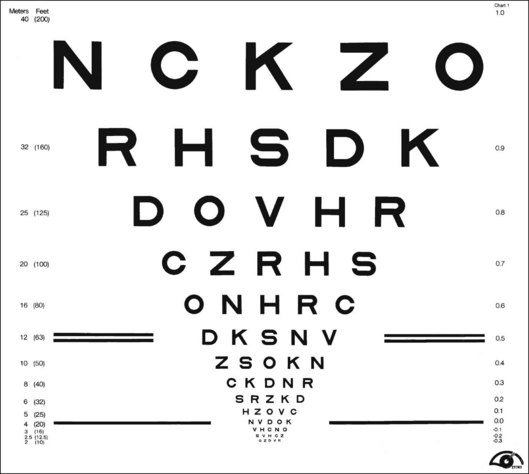
Chart layout
Careful attention must be paid to the layout of the acuity chart. The chart should follow a uniform progression of letter sizes, typically a 0.1 log unit (or 26%) reduction in size from line to line. The uniform progression ensures that a one-line loss will have the same meaning at any point on the chart and at any viewing distance. The same number of letters should appear on each line, and the spacing should be uniform, both within and between lines. The spacing requirement results in a large chart, with the letters forming an inverted triangle. The NAS-NRC recommends 8–10 letters per line, but studies6 suggest that as few as three letters are required for an accurate estimate of visual function. The ETDRS chart uses five letters per line.
Concern about uncontrolled “crowding” effects has led to further modifications of the ETDRS chart. Crowding refers to the reduced visibility of letters when they are surrounded by other letters. Crowding has a larger effect in some types of visual dysfunction, notably amblyopia7 and macular degeneration.8 For most acuity charts, letters at either the end of a line or at the top or bottom of the chart are less subject to crowding than are internal letters. To equalize crowding effects, contour interaction bars may be added around the perimeter of the chart.9
Testing procedure
Acuity test distance
ETDRS charts are available for a range of test distances from 4 meters (13 feet) to 2 meters (6.5 feet) and when used at the designated distance can measure acuities from 20/10 to 20/200. However, given the logarithmic progression of letter sizes, they can be used at any distance with an appropriate correction of the reported results. For patients with very poor acuity, the clinician may resort to finger counting or hand motion. This strategy is strongly discouraged by low-vision practitioners because it can be demeaning and depressing for the patient to be left with the impression that their vision is so poor it cannot even be measured with an eye chart. Instead, it is recommended that the patient be moved closer to the chart. Using a test distance of 50 cm and appropriate refractive correction it is possible to reliably measure “counting finger” acuity with an ETDRS chart (approximately 20/1460 ± 10%).10 “Hand motions” can be measured with some electronic acuity tests (see below). Distance itself should have little effect on visual acuity, provided that the subject’s accommodative state and pupil size are controlled. However, one study11 found that acuity changed by as much as seven letters (more than one ETDRS line) when the test distance was reduced to less than 2 meters. The reason for this discrepancy remains unexplained.
Luminance and contrast
Whatever the test distance, the chart must be adequately illuminated and of high contrast. Illumination standards vary from 100 cd/m2 in the USA to 300 cd/m2 in Germany. Increasing chart luminance improves visual acuity in normal subjects, but reaches a plateau at about 200 cd/m2.12 Various types of visual dysfunction can change the effects of luminance on acuity. For example, patients with retinitis pigmentosa may show a decrease in acuity at higher luminance, whereas patients with age-related macular degeneration often continue to improve at luminances well above the normal plateau.13 A luminance standard of 100 cd/m2 can be justified because it represents good room illumination for ordinary reading material. Furthermore, most of the currently proposed standards would yield the same acuity scores, plus or minus one letter (assuming five letters per line and a 0.1 log unit size progression) in normal subjects.
The relationship of visual acuity to letter contrast follows a square-root law.14 For example, decreasing contrast by a factor of 2 would decrease acuity by roughly a factor of 1.4. The NAS-NRC recommends that letter contrast be at least 0.85. Transilluminated, projection, and reflective charts (wall charts) can all meet these standards, but some transilluminated charts are deficient in luminance, and some projection systems lack sufficient luminance and contrast. Accurate calibration requires a spot photometer, for which procedures are described in the NAS-NRC document.1
Test administration
Administration of visual acuity tests is simple and straightforward. However, one detail often overlooked in clinical testing is that the test must be administered in a “forced-choice” manner. Rather than allowing the patient to decide when the letters become indistinguishable, the patient should be required to guess the identity of each letter until a sufficient number of errors are made to justify terminating the test. People differ in their willingness to respond to questions when they are not confident about the answers. A person with a conservative criterion answers only when absolutely certain about the identity of the letter, whereas a person with a liberal criterion ventures a guess for any letter that is even barely discernible. These two people may receive different acuity scores because of differences in their criteria rather than because of variations in visual function. This is not merely a theoretical concern. Several studies15,16 have shown that criterion-dependent test procedures lead to inaccurate and unreliable test results. Forced-choice procedures are criterion-free because the examiner, rather than the observer, determines whether the letter is correctly identified.
Scoring
Until recently, visual acuity tests were usually scored line by line with the patient being given credit for a line when a criterion number of letters were identified correctly. The NAS-NRC recommends that at least two-thirds of the letters on a line be correctly identified to qualify for passing. Allowing a small proportion of errors improves test reliability.17 For tests that follow the recommended format of an equal number of letters on each line and a constant progression of letter sizes, it is preferable to give partial credit for each letter correctly identified. This is commonly done by counting the number of letters read correctly on the entire chart and converting this to an acuity score by means of a simple formula that values each letter as L/N, where L = difference in acuity between adjacent lines and N = number of letters per line. So for a chart with five letters per line and a 0.1 logMAR (see below) progression from line to line (such as the standard ETDRS chart) each correct letter is worth 0.1/5 = 0.02 logMAR. Although differences between scoring methods are usually small, it has been shown2,6,18 that letter-by-letter scoring is more reproducible than line-by-line scoring.
Near and reading acuity tests
Near acuity is usually tested to evaluate reading vision. These tests are particularly important for prescribing visual aids for persons with low vision. Near acuity has been shown to be a better predictor of the optimal magnification needed by visually impaired readers than traditional distance acuity.19
Specifying letter size
As with all acuity tests, the most critical parameter is the visual angle subtended by the optotype. Many systems have been devised for specification of print size. One of the most common is the Jaeger J notation. Jaeger notation is based on a numeric scale (J1, J2, and so on) that follows no logical progression except that larger numbers correspond to larger print sizes. Furthermore, print with the same J specification can vary by as much as 90% from one test manufacturer to another.20
Alternatives to the Jaeger notation are the typesetter’s point system, the British N system, and the M notation introduced by Sloan. The typesetter’s point is commonly used to specify letter size for printed text and is equal to 0.32 mm (1/72 inch). However, the measurement refers to the size of the metal slug that contains the letter and varies from one font to another. A study21 of the effect of font on reading speed showed that the nominal sizes of printed text can be very misleading. Of four fonts, all labeled as 12 point, one was much more legible than the other three. But it turned out that the more legible font was actually larger than the others and when equated for real size there was no difference in legibility.
The British N system standardized the point size specification by adopting the Times Roman font. Sloan’s M notation,4 widely used in the USA, is standardized according to the height of a lower-case “x.” A lower-case 1M letter subtends 5 minarc at a 1-meter viewing distance and corresponds roughly to the size of ordinary newsprint. None of the print size specifications can be used for quantitative comparisons unless viewing distance is also specified. For example, 1M print read at a distance of 40 cm would be recorded as 0.40/1.00M.
Stay updated, free articles. Join our Telegram channel

Full access? Get Clinical Tree


